7 Tables
7.1 Managing Columns
You can display, hide, resize, and reorder the columns in every table. To customize your setup, see Using the Columns Manager.
7.1.1 Displaying and Hiding Columns
Right-click on any column header to display the list of columns available in the panel. Only columns that have checks against them display. In most panels, many more columns are available.
To display a column, click its title in the list to place a check against it. To hide a column, click its title in the list so that the check disappears.
TIP: When columns are hidden, you can view the information in those columns for a particular table entry by right-clicking on the entry and selecting View > Details.
7.1.2 Reordering Columns
You can rearrange columns in tables by moving them to new locations. Click on the column header and drag the column to the new location in the table.
7.1.3 Resizing Columns
To change the width of a column, move your mouse over the column border in the header row to see the cursor change to a two sided-arrow. Then, click and drag the border to resize the column.
7.1.4 Using the Columns Manager
With the Columns Manager, you can select the columns you want displayed, arrange them in the desired order, and customize each column to the smallest detail.
CAUTION: Column customizations made in the Columns Manager apply to the current instance of the panel only, and are stored in the workspace. This means that they will be lost if you close the panel, and that you will not be able to use your customizations in the future session unless you save the workspace (see Saving a Workspace to a File).
To open the Columns Manager, right-click on any column header and select Columns Manager at the bottom of the shortcut menu, or right-click anywhere in the table and select Columns Manager. The Columns Manager dialog box displays.
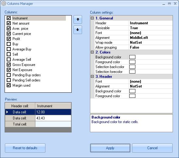
Figure 72: Columns Manager
Displaying and Hiding Columns with the Columns Manager
The Columns box on the left lists the columns available in the panel. Visible columns have checks against them. Check the box to display a column. Uncheck the box to hide the column.
Reordering Columns with the Columns Manager
The order of columns in the Columns box is the same as that in the table. To reposition a column in the list, select it and use the  and
and  buttons. You can select a range of columns by holding down the Shift key and clicking the first and last columns in the range.
Configuring Each Column
You can configure the settings for each column independently.
To configure the settings for a particular column:
- Select a column in the Columns box. The Preview box below shows how the column looks on the screen.
- The Column settings area on the right displays all settings available for the selected column, arranged in categories. To expand a collapsed category, click the
 sign.
sign. - Select a setting. The cell containing the value becomes editable, and the box below the Column settings area displays a short description of the setting.
- Change the setting as described in the Column Settings sections below. The Preview box updates as soon as you click outside the edit cell.
When a setting is set to (none) or NotSet, the column uses the setting that applies to the entire table. see Customizing Tables for details about changing the setting for the entire table.
You can select multiple columns at a time and configure their common settings altogether. To select more than one column, hold down the Ctrl key when clicking the columns. To select a range, hold down the Shift key and click the first and last columns in the range.
To close the Columns Manager dialog box and apply the changes to the table, click Apply.
General
The General category lists the following miscellaneous settings.
NOTE: Customizing columns with many colors, images, and fonts may slow your system down.
- Header: The text to display in the columns' header. To rename the column, type in the new text.
- Resizable: Set to True to change the column width manually. Click the down arrow and select the new setting from the list.
- Font: The font for column values. To change the font, click the ellipsis (...) button. In the Font dialog box, select the font, style, size and effects. When you finish, click OK.
- View mode: Specifies whether the value must be shown as a numeric value (Value), a horizontal bar (Bar), or both (Bar & value). Applies to numeric columns only.
- Bar type: Only available when Bar or Bar & value is selected for View mode. When set to Absolute, the highest value in the column is represented by a bar spanning the entire column width, and smaller values are represented by proportionally shorter bars. When set to Relative, you need to provide a value that will correspond to the full-length bar.
- Relative: The numeric value representing the full-length bar. Only available when Relative is selected for Bar type. Type in the value.
- Coloring mode: Applies to dynamic numeric columns only. When set to None, the cells use a static background color. When set to By difference, the cells are highlighted with distinct colors based on the difference from the previous value. When set to By sign, the highlight color depends on whether the value is negative or positive. Click the down arrow and select the new setting from the list.
- Alignment: Specifies how the contents are aligned in the cells. Click the down arrow and select the new setting from the list.
- Wrap mode: When set to True, long cell contents are wrapped; otherwise, the portion of the contents that does not fit within the cell is hidden. Click the down arrow and select the new setting from the list.
- Allow grouping: When set to True, you can group table entries by this column (see Grouping Entries). Click the down arrow and select the new setting from the list.
Colors
The Colors category lets you choose the colors for the cells:
- Background color: The static cell background color. This setting only applies when Coloring mode is set to None. To select a new color, click the down arrow. In the list that opens, select one of the tabs (Custom, Web, or System) and click the color you want.
- Foreground color: The static cell foreground color (text color). This setting only applies when Coloring mode is set to None. To select a new color, click the down arrow. In the list that opens, select one of the tabs (Custom, Web, or System) and click the color you want.
- Selection backcolor: Background color for selected cells. To select a new color, click the down arrow. In the list that opens, select one of the tabs (Custom, Web, or System) and click the color you want.
- Selection forecolor: Foreground color (text color) for selected cells. To select a new color, click the down arrow. In the list that opens, select one of the tabs (Custom, Web, or System) and click the color you want.
Header
The Header category contains the settings that define the appearance of the column header:
- Font: Header text font and formatting. To change the font, click the ellipsis (...) button. In the Font dialog, select the font, style, size and effects. When you finish, click OK.
- Alignment: Specifies how the header text is aligned in the cell. Click the down arrow and select the new setting from the list.
- Background color: Header cell background color. To select a new color, click the down arrow. In the list that opens, select one of the tabs (Custom, Web, or System) and click the color you want.
- Foreground color: Header cell foreground text color. To select a new color, click the down arrow. In the list that opens, select one of the tabs (Custom, Web, or System) and click the color you want.
Total
The Total category contains the totaling options for the column. This category applies to numeric columns only.
- Show total: When set to True, the bottom-most row of the table shows the total of the column. Click the down arrow and select the new setting from the list. The following settings become available when Show total is set to True.
- Type: The type of total to use: Sum, Average, or Count. Click the down arrow and select the new type from the list.
- Text: The label to display with the total. Type in the new label.
- Font: The font and formatting of the label. To change the font, click the ellipsis (...) button. In the Font dialog, select the font, style, size and effects. When you finish, click OK.
- Alignment: Specifies how the total value is aligned in the cell. Click the down arrow and select the new setting from the list.
- Background color: Total cell background color. To select a new color, click the down arrow. In the list that opens, select one of the tabs (Custom, Web, or System) and click the color you want.
- Foreground color: Total cell foreground color (text color). To select a new color, click the down arrow. In the list that opens, select one of the tabs (Custom, Web, or System) and click the color you want.
7.2 Customizing Tables
Power Trader provides a variety of ways for you to modify a table's appearance to improve visual representation of the data.
7.2.1 Hiding and Displaying the Grid
You can hide or show the table's grid. Right-click the table and select View > Show Grid.
7.2.2 Hiding and Displaying Scrollbars
The scrollbars appear automatically when needed. To hide the scrollbars, right-click the table and select View > Show Scrollbars. When the scrollbars are hidden, you can still move through the table using the navigation keys.
7.2.3 Changing Colors
In each table, you can customize the background and foreground text colors, highlight colors for dynamic cells, selection colors, and grid color. To change colors, right-click the table and select View > Colors.... This opens the Color Settings dialog box for the table.
To change a color, click the Value cell for the color, then click the ellipsis (...) button. This opens the standard Windows Color dialog box. Choose the color you want and click OK.
7.2.4 Changing the Font
You can change the font for all text contained in the table. Right-click the table and select View > Font.... This opens the standard Windows Font dialog box. Select the font, style, size and effects, then click OK.
7.3 Managing Table Data
You can group table rows by column as well as and filter, sort, and search the data in the table.
7.3.1 Grouping Entries
You can group table entries by column, provided the column has the Allow grouping option set to True in the Columns Manager (see Using the Columns Manager). The column by which you are grouping entries does not have to be visible.
To group the entries by a column, right-click the table and select Group by > [column name]. For example, the following is a snapshot of the Positions panel (Positions Panel), grouped by the Symbol column.
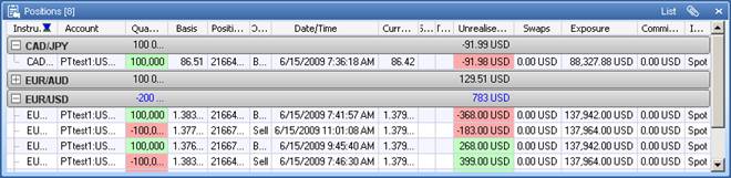
Figure 73: Table with Grouped Entries
Each group can be collapsed by clicking the gray grouping bar. When the group is collapsed, the grouping bar displays column totals for the group. Clicking the grouping bar again expands the group.
To remove the grouping, right-click the panel and select Group by > <None>.
7.3.2 Sorting and Filtering Table Data
You can sort table data can by any column. Click a column header to sort the data in descending order. To sort in ascending order, click the header again. After you sort a column, an arrow appears in the header showing sort direction.
You can lock sorting by right-clicking the table and selecting View > Lock Sorting. When sorting is locked, an accidental click on a column's header will not change the sorting order.
You can move entries by clicking and dragging them to new locations in the table.
You can filter the data in a table with either a quick filter or with the Filter Manager dialog. For information about using the Filter Manager dialog, see Filtering Entries Using the Filter Manager.
For quick filters, you can filter the data in a column by magnitude, by date/time, or by text depending on the type of data the column contains.
Filter by Magnitude
For columns that contain numerical values, such as position balance or bid price, you can use a quick filter to show a specific range of values.
To filter a column by magnitude:
- Mouse over the heading of a column that contains numbers.
The filter button  appears in the heading.
- Click the filter button.
A filter window opens.
- Enter values in the More and Less fields and either press Enter or click outside of the filter window. If you click the Filter manager link the Filter Manager dialog opens. see Filtering Entries Using the Filter Manager for more information.
The table updates to show the items that are included by the filter.
Filter by Date/Time
For columns that contain date and time values, such as expiry dates, you can use a quick filter to show a specific time range.
To filter a column by date/time:
- Mouse over the heading of the column that contains dates or times.
The filter button  appears in the heading.
- Click the filter button.
A filter window opens.
- Enter values in the Before and After fields or click the "Date to date", "Week to date", and "Month to date" shortcuts to enter a date range.
- Either press Enter or click outside of the filter window. If you click the Filter manager link the Filter Manager dialog opens. see Filtering Entries Using the Filter Manager for more information.
The table updates to show the items that are included by the filter.
Filter by Items
For columns that contain text values, such as instrument name or instrument type, you can use a quick filter to show specific items.
To filter a column by items:
- Mouse over the heading of the column that contains text.
The filter button  appears in the heading.
- Click the filter button.
A list window opens that contains all the possible values in the table.
- Click an item in the list to check the item and include it in the filter results. You can click one or more items. Click the item again to clear its check mark and remove it from the filter. Clear all check marks to show all items. Note that the table updates dynamically as you check/uncheck items.
- Either press Enter or click outside of the filter window to close the window. If you click the Filter manager link the Filter Manager dialog opens. see Filtering Entries Using the Filter Manager for more information.
7.3.3 Filtering Entries by Selection
Filtering by selection is a simple way to limit the number of entries in a panel. To apply a filter, select the entries you want displayed. To select multiple entries, hold down the Ctrl key and click each entry. To select a range of entries, hold down the Shift key and click the first and last entries of the range. Then, right-click and select Filter > Show Selected. Your selected entries display, and the non-selected entries do not.
To invert the filter, right-click and selected Filter > Show Non-Selected. To remove the filter, right-click and select Filter > Show All.
7.3.4 Filtering Entries Using the Filter Manager
For conditional filtering, use the Filter Manager dialog to create filters and turn them on when necessary.
IMPORTANT: Filters set up in the Filter Manager dialog apply to the current instance of the panel only, and are stored in the workspace. This means that you must save the workspace in order to save your filters. Otherwise, they will be lost if you close the panel. see Saving a Workspace to a File for details.
To set up a filter with the Filter Manager dialog:
- Do one of the following:
- Mouse over the heading of the column that you want to filter, click the filter button
 that appears, then click Filter manager in the pop-up window.
 - Right-click the table you want to filter and select Filter > Manager.
The Filter Manager dialog opens.
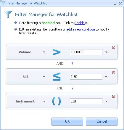
Figure 74: Filter Manager Dialog
The conditions of the filter are represented by horizontal bars separate by the Boolean operators AND or OR.
- Make sure that data filtering is enabled by clicking the Enable/Disable toggle link.
- Click the add a new condition link to add a new condition.
- For each condition in the filter you can do the following:
- Select a table column to which the condition applies by clicking the down arrow next to the column title and choosing a new column from the list.
- Select the filter operator by click Condition and select a condition from the list. see Filter Operators for more information.
- Enter a value to filter the column or click the arrow button next to the field and choose another column in the table to use in comparison to the filtered columns.
- Remove a condition by clicking the remove
 button in the corner of the condition bar.
 - Set the condition's relation to the next condition in the filter by clicking the AND or OR Boolean operator and choosing a new operator from the list.
- Click OK.
The Filter Manager dialog closes and the table updates to show the results of the filter. A new filter button appears in the title bar of the table window indicating both that the table is currently being filtered and the number of items shown versus the total number of items possible.
You can click this filter button to open the Filter Manager dialog.
To remove the filter and clear all filter settings, right-click the table and select Filter > Show All.
7.3.5 Filter Operators
The following operators are used to set up filters in the Filter Manager dialog:
Operator |
Description |
|
Equals: Includes items that are equal to the value you enter. |
|
Not Equal: Excludes items that are equal to the value you enter. |
|
Present: Applies only to text data and works like a case-sensitive text search. Includes items that contain the characters you enter, either as a whole word or as part of a line. |
|
Not present: Applies only to text data and works like a case-sensitive text search. Excludes items that contain the characters you enter, either as a whole word or as part of a line. |
|
Greater Than: Includes items greater than but not equal to the value you enter. |
|
Greater Than or Equal: Includes items greater than and equal to the value you enter. |
|
Less Than: Includes items less than but not equal to the value you enter. |
|
Less Than or Equal: Includes items less than and equal to the value you enter. |
7.3.6 Searching Entries
You can search table entries by a keyword or a part of word.
To search table entries:
- Right-click inside the panel and select Filter > Search. This opens the Find dialog.
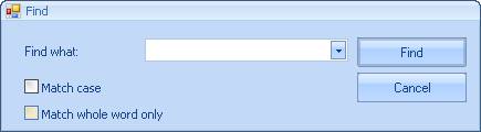
Figure 75: Table Search Dialog
- Enter the search keyword or, if you have searched on this term previously, select it from the drop-down list.
- Check the options that apply.
- Click Find.
Entries that match the search criteria are selected in table. For example, the search criteria shown in the above figure, when applied to the Positions panel (Positions Panel), selects positions in currency pairs where USD is the base or quote currency, and displays at the top of the panel.
7.4 Using Table Layouts
A table layout stores your table customizations such as colors, fonts and other settings (see Customizing Tables). You can save a table layout and then apply it to another table. Layouts are saved in table template (.ttp) files.
To save the current table layout to a file:
- Right-click inside the table and select View > Layout > Save. This opens the Save Template to File dialog box.
- Browse to the folder where you want to place the template file.
- Enter a name for the template file.
- Click Save.
To load the saved table layout from a file and apply it to a table, right-click inside the target table and select View > Layout > Load. In the Load Template from File dialog box, locate and select your .ttp file and click Open.
To return to the standard table layout, right-click inside the table and select View > Layout > Load Default.
You can also set a customized table layout as the default by right-clicking and selecting View > Layout > Set as Default. You may want to save the standard table layout in a separate file before doing this.
NOTE: The default layout applies to all newly opened panels. To turn this off, select BNFX Button > Settings. In the Workspaces and Layouts section, clear the check against Apply default layout to new panels.
7.5 Using the Trigger Manager
You can create triggers to alert you, or take an action, when certain conditions occur. You create a trigger in the table where Power Trader checks for the condition, and each table can have multiple triggers associated with it. The Trigger Manager enables you to create triggers ranging from alerts to simple trading strategies.
Setting up a trigger involves three steps: create a new trigger, specify the conditions for the trigger, and associate actions with the trigger. Each step is explained below.
To open the Trigger Manager, right-click the table and select Trigger Manager. When open for the first time, the Trigger Manager dialog box has three pairs of empty boxes in it. The boxes on the left will list the triggers, conditions and actions you create; the boxes on the right is where you configure each of them.
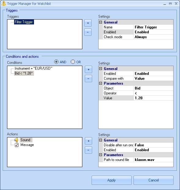
Figure 76: Trigger Manager Dialog
CAUTION: Triggers set up in the Trigger Manager apply to the current instance of the panel only, and are stored in the workspace. This means that they will be lost if you close the panel, and that they will not last beyond your current session unless you save the workspace. see Saving a Workspace to a File for details.
7.5.1 Creating a New Trigger
To create a new trigger:
- In the Triggers area, click the
 button. The new trigger appears in the Triggers list.
 - Configure the trigger's general settings in the Settings box:
- Click Name and type in the name for the trigger.
- Click Check mode and select when to check the conditions:
- On insert to check the conditions for any new entry added to the table:
- On update to check the conditions whenever the table is updated.
- Always to check the conditions both when an entry is added and when the table is updated.
- Leave the Enabled option set to Enabled. Selecting Disabled lets you turn off the trigger temporarily without deleting it.
7.5.2 Specifying Conditions for the Trigger
Configuring conditions for the trigger starts with adding a condition group. In a condition group, the conditions are linked with the logical operator AND, which means all of the conditions must be true for the group to evaluate to true. Multiple condition groups are linked with the logical operator OR, which means any of the condition groups must evaluate to true for the trigger to fire. In the Trigger Manager, even a single condition must be contained inside a condition group.
- Add a condition group by clicking the
 button to the left of the Conditions list and selecting Condition Group.
 - With the new condition group selected in the Conditions list, add a condition by clicking the
 button again, selecting Condition this time.
 - Configure the condition's settings in the Settings box:
- Click Compare with and select what you will use as a comparison value for the condition:
- Value to compare to a fixed value you provide.
- Column to compare to the dynamic value in the corresponding cell of a specific column.
- Click Object and select the column of the table that you want to compare with the comparison value or column.
- Click Operator and select the operator to compare the object and the comparison value or column:
Operator |
Description |
= |
Equals. The condition evaluates to true if Object is equal to Value. |
!= |
Not Equal. The condition evaluates to true if Object is not equal to Value. |
PRESENT |
The condition evaluates to true if the text of Object contains Value. The comparison is case-sensitive. |
NOT PRESENT |
The condition evaluates to true if the text of Object does not contain Value. The comparison is case-sensitive. |
> |
Is Greater Than. The condition evaluates to true if Object is strictly greater than Value. |
>= |
Is Greater Than or Equal. The condition evaluates to true if Object is greater than or equal to Value. |
< |
Is Less Than. The entry meets the condition if Object is strictly less than to Value. |
<= |
Is Less Than or Equal. The entry meets the condition if Object is less than or equal to Value. |
- If comparing to value, click Value and type in the comparison value. If comparing to column, click Column and select one of the table's columns from the list.
The configured condition appears in the Conditions box under Condition Group. Continue adding and configuring conditions or condition groups as necessary.
7.5.3 Associating Actions with the Trigger
A single trigger can run one or more actions. Each action can run once and then become disabled, or run repeatedly whenever the condition becomes true. For example, the order needs to be placed only once when an indicator reaches a certain value, while the coloring must be applied every time a news story matching your criteria comes in.
To associate an action with a trigger:
- Click the
 button to the left of the Actions list and select an action:
Icon |
Action |
Description |
Parameters |
|
Message |
Displays a message in a popup box. |
Text: The text of the message. |
|
Sound |
Plays a sound. |
Path to sound file: The path to a .wav file. To select a file, click the ellipsis (...) button and browse to the file. |
|
Sends an email notification. |
Email address: The email address for the notification. |
|
|
Coloring |
Changes the background color of the cell. |
Color: The new background color for the cell. To select a color, click the down arrow and select a color from one of the three tabs. |
|
Place Order |
Places a predefined order. |
Order: The predefined order to execute. To define the order, click the ellipsis (...) button. In the Order Setup dialog box, enter the order settings as you would using the Order Entry panel (Order Entry Panel), then click Apply. |
|
Cancel Order |
Cancels a previously placed order. |
Order ID: The order to cancel. Click the down arrow and select the order ID. |
- Configure the action's parameters as described in the above table for each action. If needed, click Disable after run once and modify the default setting.
- Add other actions as necessary and configure them.
- Click Apply. The following message appears: "Apply triggers to existing rows?" Click Yes to check the condition for the rows already in the table, or No otherwise.
NOTE: Before setting up emails, select BNFX Button > Settings and make sure that your Mail Server settings are valid.
7.5.4 Deleting and Disabling Triggers, Conditions and Actions
You can delete either the entire trigger, a specific condition group, condition, or an action associated with it by selecting the item and clicking the  button. You can also disable each item temporarily by setting its Enabled option to Disabled.
Back to BNFX - An Integral Power Trader Forex Broker
Power Trader is a product of Integral Development Corp., licensed and customised for BNFX Capital Ltd. All rights reserved.
RISK WARNING: Forex trading involves risk of loss and may not be suitable for all investors.